Shades of Influence: The Impact of Pantone and WGSN Color Forecasts on 2026 Fashion
Color forecasting plays a powerful role in shaping fashion trends, but what happens when the industry’s leading platforms don’t align? This blog explores the contrasting approaches of Pantone and WGSN, examining how their differing color forecasts influence design decisions, brand direction, and trend adoption across the fashion industry. A closer look at how these forecasts guide — and sometimes divide — the future of fashion.
Musab Bin Mustansir
1/15/20262 min read


For the past several years, the global fashion industry has experienced a remarkable level of alignment in color forecasting. Major authorities such as Pantone and WGSN + Coloro consistently selected Colors of the Year that, while different in name and nuance, belonged to closely related color families. These convergences reflected shared cultural moods and made it easier for brands to align palettes across fashion, footwear, and retail environments.
However, 2026 marks a noticeable shift.
This year, leading forecasting platforms have diverged sharply in their headline color choices — signaling not confusion, but rather a deliberate expansion of the color landscape.
A Look Back: Color Alignment in Recent Years
From 2023 to 2025, Pantone and WGSN largely forecasted colors that echoed the same emotional and chromatic direction:
2023 emphasized expressive optimism, with Pantone’s Viva Magenta aligning emotionally with WGSN’s Digital Lavender — bold yet emotionally resonant hues.
2024 moved toward softness and care, with Peach Fuzz and Apricot Crush reinforcing warmth, human connection, and comfort.
2025 leaned into grounded sophistication and depth, with Pantone’s Mocha Mousse and WGSN’s Future Dusk reflecting stability, introspection, and quiet luxury.
While these colors differed technically, they consistently belonged to neighboring color families, reinforcing a cohesive industry direction.
2026: A Clear Divergence in Color Direction
In contrast, the 2026 forecasts introduce two dramatically different color families:
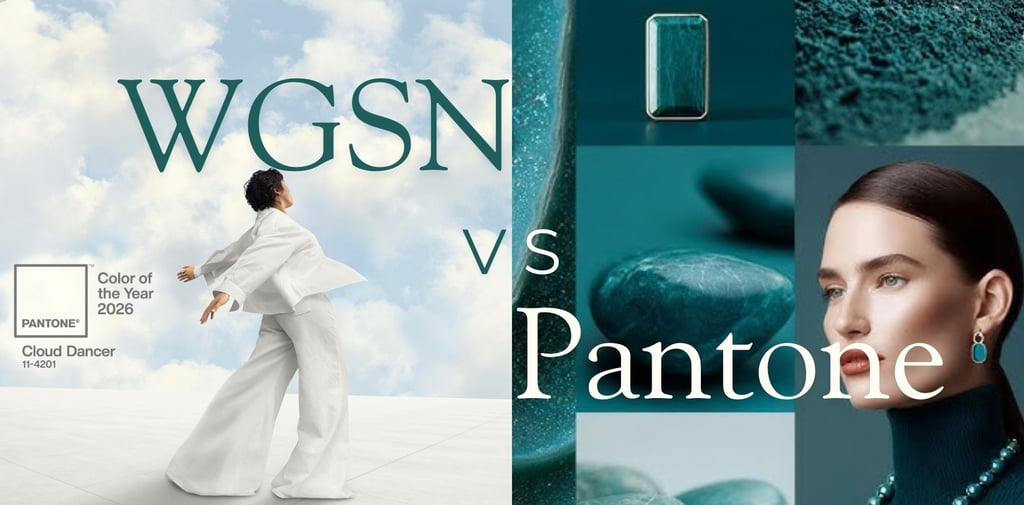
Pantone’s Color of the Year, Cloud Dancer, is a soft off-white that embodies calm, clarity, minimalism, and visual reset.
WGSN + Coloro’s Color of the Year, Transformative Teal, is a saturated blue-green symbolizing change, ecological awareness, renewal, and forward momentum.
This contrast — neutral versus expressive, quiet versus energized — is far more pronounced than in recent years.
Why This Divergence Matters
Rather than signaling disagreement, this split reflects a fragmented but realistic cultural landscape:
Dual consumer needs
Today’s consumers are navigating opposing emotional states — a desire for calm and safety alongside a need for expression, transformation, and optimism. Forecasting platforms are responding by spotlighting different, equally valid emotional resolutions.Different forecasting lenses
Pantone often reflects broad cultural sentiment and timeless design influence, making Cloud Dancer a natural response to global fatigue and the desire for simplicity.
WGSN, grounded in behavioral data and future-focused consumer research, highlights Transformative Teal as a color of progress, regeneration, and adaptability.
Strategic expansion, not contradiction
The divergence allows the industry more creative room. Rather than narrowing palettes, 2026 encourages layered color strategies.
What This Means for Fashion, Footwear, and Retail
The implications are practical and significant:
Fashion will likely balance neutral foundations (off-whites, creams, soft earth tones) with statement colors such as teal, deep blues, and nature-inspired hues.
Footwear can leverage Cloud Dancer for versatile core styles while using Transformative Teal for color-driven silhouettes and trend-forward drops.
Retail and interior spaces may use Cloud Dancer as a calming backdrop, with teal accents to draw attention, signal sustainability narratives, or energize key touchpoints.
Rather than choosing one direction, brands can strategically deploy both.
A Broader Palette for a More Complex Year
Compared to previous years, 2026 is poised to deliver a wider, more diverse color range across collections and spaces. This reflects not instability, but maturity in trend forecasting — acknowledging that modern consumers are not driven by a single emotional narrative.
The takeaway for brands is clear:
Follow color families, not just hero shades.
Understand the emotional drivers behind each forecast.
Use contrast intentionally — pairing calm neutrals with expressive accents to build depth, relevance, and flexibility.
Conclusion
2026 represents a turning point in color forecasting. The divergence between Cloud Dancer and Transformative Teal signals an industry ready to embrace complexity, contrast, and choice. For designers, retailers, and strategists, this is not a challenge — it is an opportunity to create richer, more adaptable color stories than in years past.
© 2024. All rights reserved @ Cavitystudios.com
Office
Cavity Studios — Office
39 West End Court
West End Lane, Stroke Poges SL2 4NB
London, United Kingdom.
✉️ hello@cavitystudios.com
Studio
Cavity Studios — Design Studios
Plot#12-E, First Floor.Block A-1.
Punjab Government Employees Cooperative Society(PGECHS) Phase-1.
PIA Road, Lahore, Pakistan.
✉️ marketing@cavitystudios.com
Office
Cavity Studios — Sourcing Office
Wuhan, People's Republic of China.
✉️ sourcing@cavitystudios.com


